An Aura of Words
A scrollytelling portrait of Lugano's five green spaces, built entirely from the words of the people who visit them. It encodes thousands of citizen reviews into six semantic lenses to give each park a color-blended 'aura', then asks the only question that matters: is this how you see this park?
- Role
- Data pipeline & front-end
- Year
- 2026
- Host
- SUPSI · Making Use of Data
- Scope
- Team of five
- Shipped
- Live visualization + participatory layer
A public park is officially described through institutional channels: planning documents, maintenance reports, facility inventories. Those records tell you what is physically present, and almost nothing about how people actually experience the place, what they feel there, or what meaning they give it.
The project starts from the opposite premise. The language a citizen uses in a review, written voluntarily just after a visit, holds a richer and more honest portrait of a park than any official record. It is informal, affective, and unprompted, and that informality is the feature, not the flaw.
The catch is that this language is vast, unstructured, and scattered across hundreds of reviews. On its own it cannot be read at a glance. The challenge was to make it legible without scrubbing away what makes it valuable: its texture, its subjectivity, its contradictions.
- The data pipeline: scraping the reviews and the lexicon-based classification that encodes them
- Front-end implementation of the scrollytelling and the live visualization
- The semantic framework, the category validation, and the editorial direction with the team
- Parts of the visual identity and interface design, shared within the team
Team of five (Annabelle Conron, Nerea Asensio, Nicholas Vos, Jérémy Martin, Julie Alme) for Making Use of Data at SUPSI.
Small data over the official record
The course's idea that stuck was small data: against the reflex to reach for big datasets, it argues for situated, citizen-generated data, qualitative and grounded in lived experience, and meaningful precisely because it is not produced to satisfy a report. A Google Review is exactly that kind of small data.
So the project's whole stance is a debate, not a verdict. It does not ask whether the parks are good or bad. It asks whose experience counts in how we understand public space, and whether the collective voice of citizens, once made legible, can say something the official channels cannot.
Reviews, scraped and kept whole
The raw material is Google Reviews of five Lugano parks, gathered with a custom Python scraper that loads each park's reviews and pulls the text, the star rating, the date, and the reviewer name. Only reviews with written text were kept, in whatever language they were left in, mostly Italian, with German, English, and French in the mix.
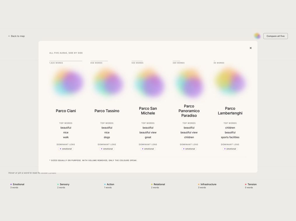
The five parks are deliberately unequal, because that is how attention really falls: Parco Ciani alone accounts for more than 1'600 reviewed words, while little Parco Lambertenghi contributes 65. We kept that imbalance rather than normalizing it away, because the volume of what people choose to say about a place is itself part of the portrait.
Six lenses on the language
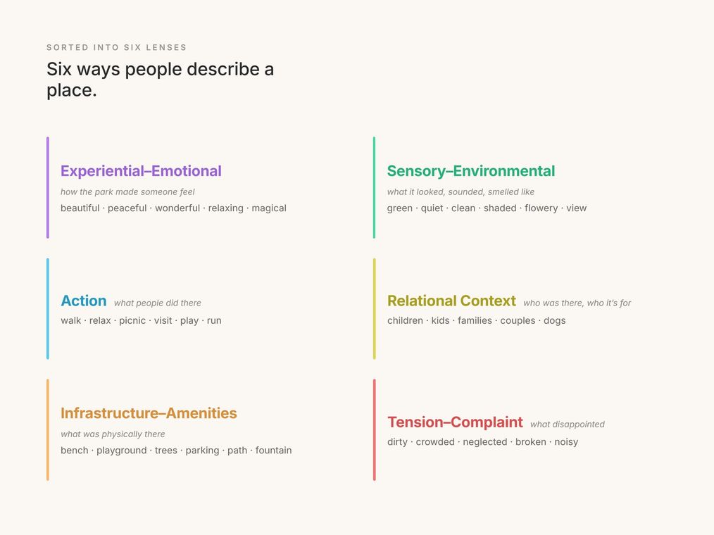
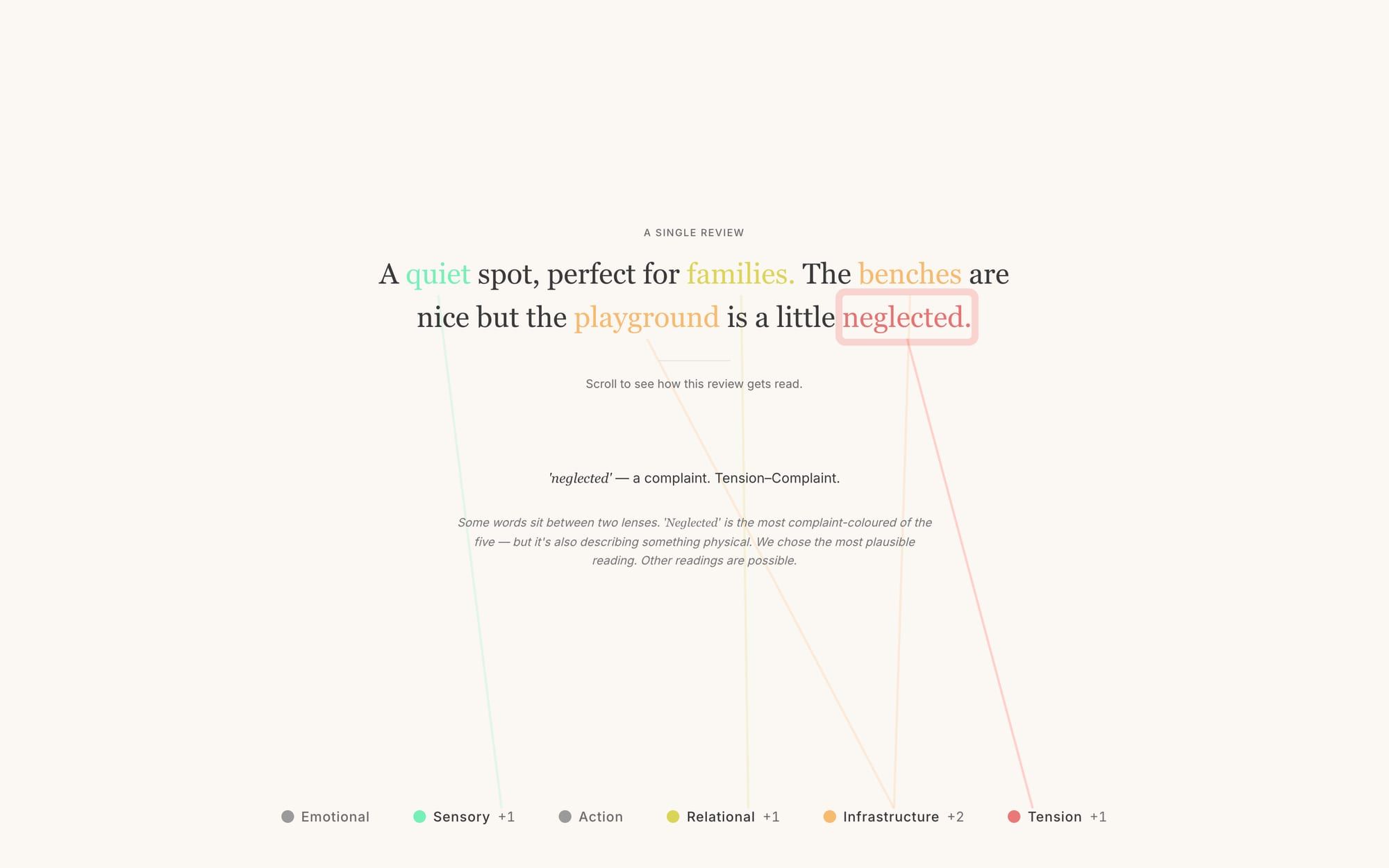
Every meaningful word is sorted into one of six lenses: the visitor's inner state, the sensory environment, the actions people take, the social context, the physical infrastructure, and tension or complaint. Functional words are ignored; only the words that carry real descriptive weight are kept.
The encoding is a hand-curated lexicon matched word by word across each park's reviews. Each occurrence also records the other meaningful words that appear alongside it in the same review, so the data captures not just which words are used, but which ones tend to appear together.
Language as a living aura
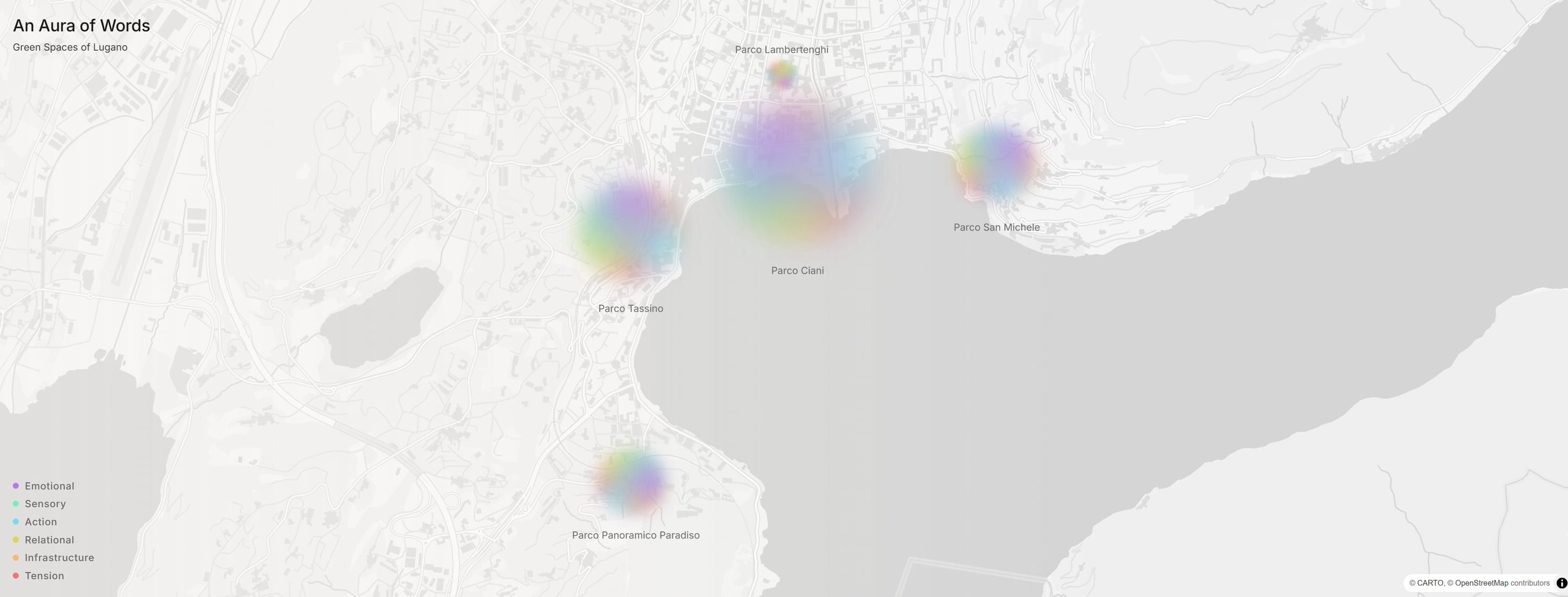
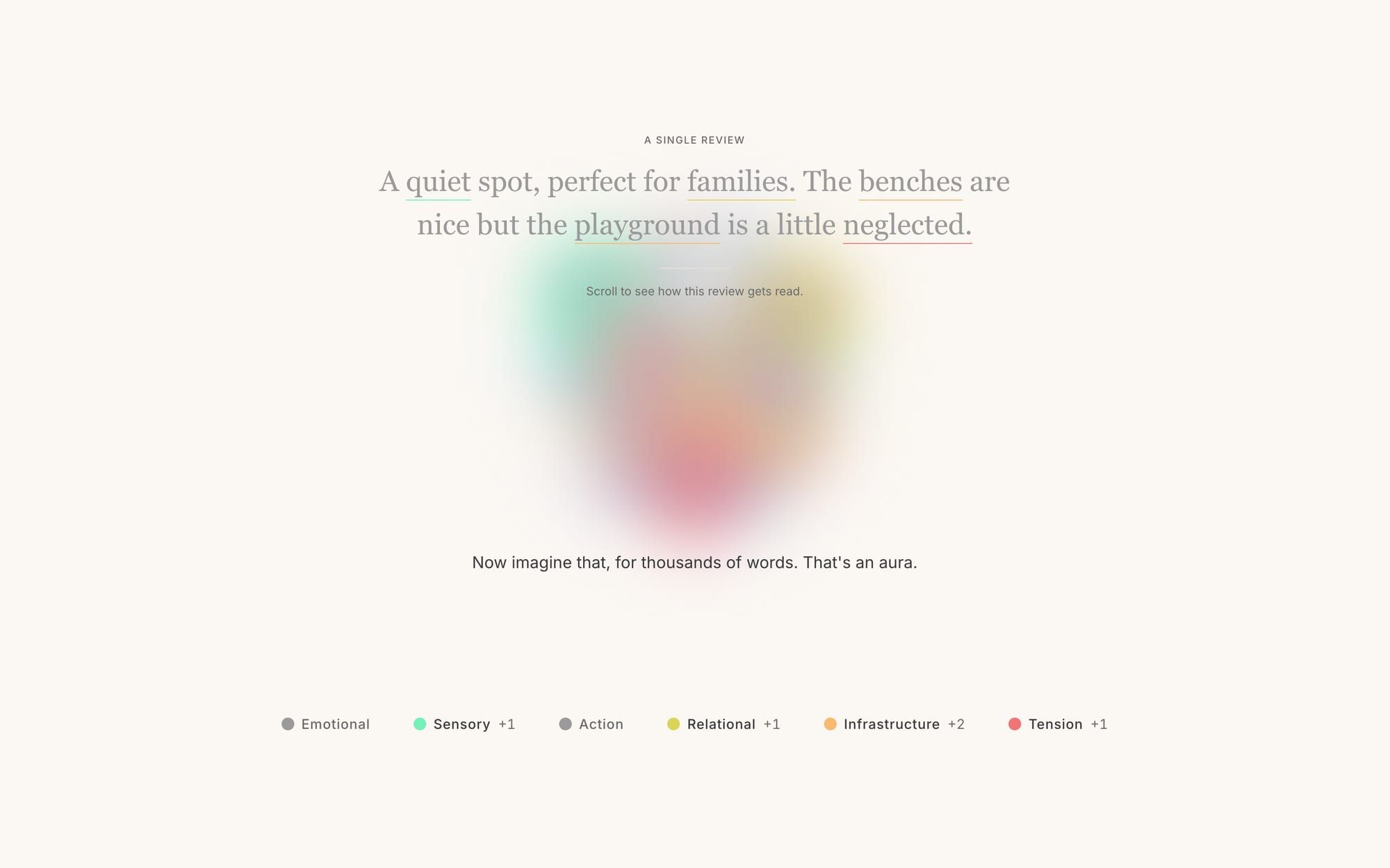
Each park's aura is an organic, color-blended blob where the area of each color is the proportional weight of that category in its reviews, with a subtle breathing motion so it reads as a living portrait rather than a fixed chart. Color is the primary encoding, so a reader recognizes a category instantly, without labels.
What gives each aura its character is how the lenses mix. People rarely describe a park in one register; a single review often moves between feeling, sensory detail, and complaint in the same breath. The aura is built to show that blend, not just which lens is largest, but which ones tend to occur together, which is what makes one park's portrait recognizably different from another's.
From one review to your ideal park
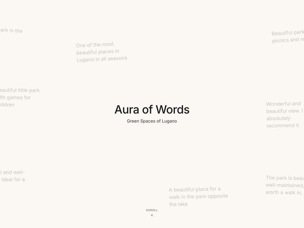
The interface is a guided scrollytelling journey. It opens over a drift of real review snippets, lays out the six-category framework, then runs a methodology lab where you watch a single review get taken apart word by word, each meaningful term lighting up in its category color as a running tally builds the aura in front of you.
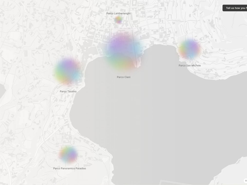
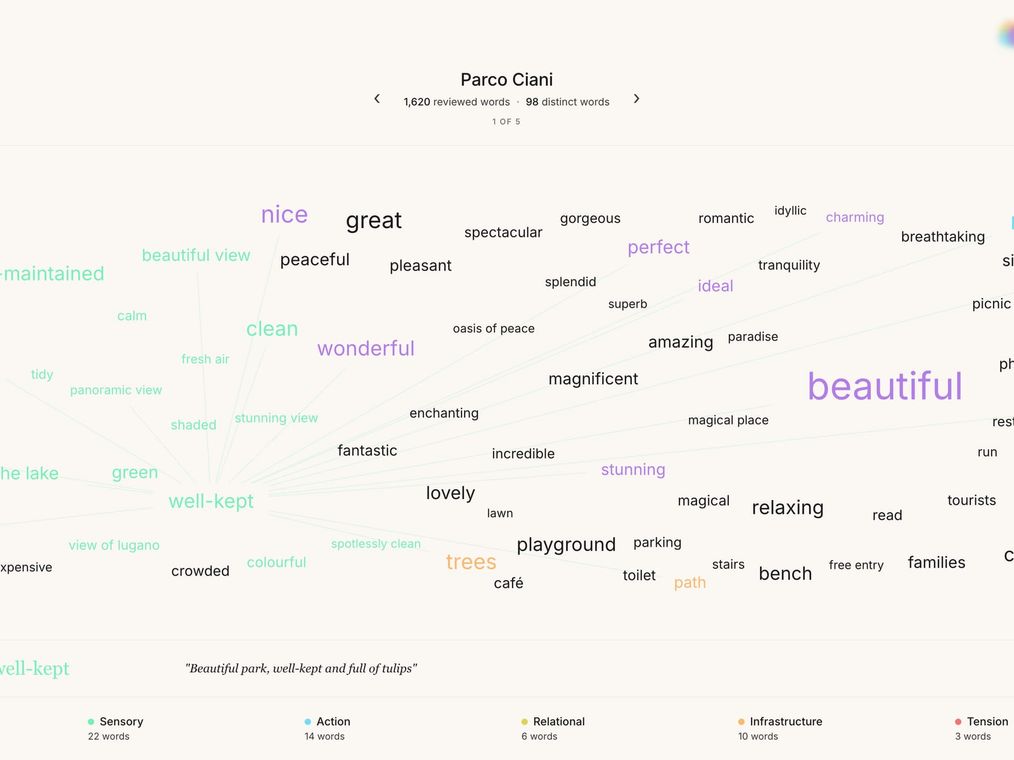
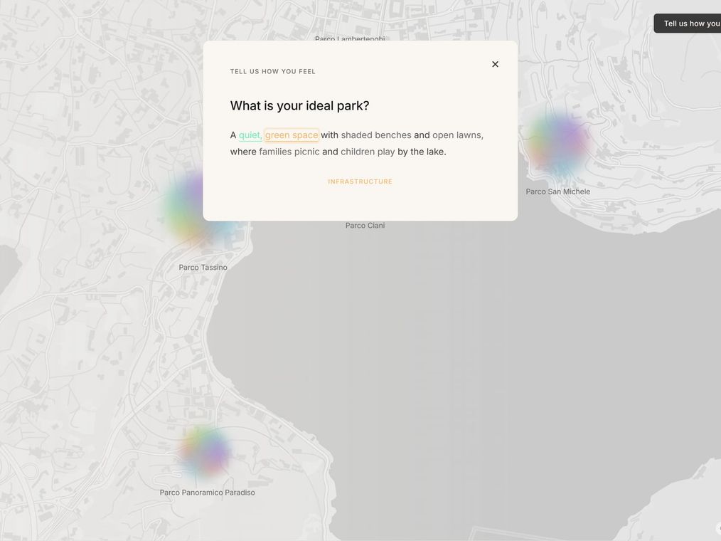
From there it opens out. A map places the five auras on Lugano, sized by review volume; a comparison view sets their chromatic signatures side by side; and a per-park word map shows every categorized word as a color-coded network, so you can see how themes interconnect. It ends by handing the method to the reader: a prompt asks what your ideal park would be, and as you type, your words are classified live against the same six lenses. You stop being an audience and become another voice in the data.
A live scrollytelling visualization: five comparable park auras on a map, a methodology lab that builds an aura from one review in real time, and per-park word maps that show how themes interconnect.
A faithful encoding of citizen language at scale, keeping its texture, subjectivity, and contradictions intact rather than collapsing it into a rating or a ranking.
A participatory layer that classifies a reader's own "ideal park" live against the six lenses, turning the audience from consumers of the data into contributors to it.
The idea I keep from this project is small data. Where the instinct is to reach for the biggest dataset available, the more interesting move was to take a small, messy, human one seriously: voluntary reviews, full of feeling and contradiction, and to make them legible without sanding off the parts that make them honest. Treating data as something that gains meaning through interpretation and dialogue, rather than as a fixed fact, is what turned the project from a visualization into a debate, and the contribution prompt is what closes the loop, handing the method back to the people the words came from.