UBS Family Space
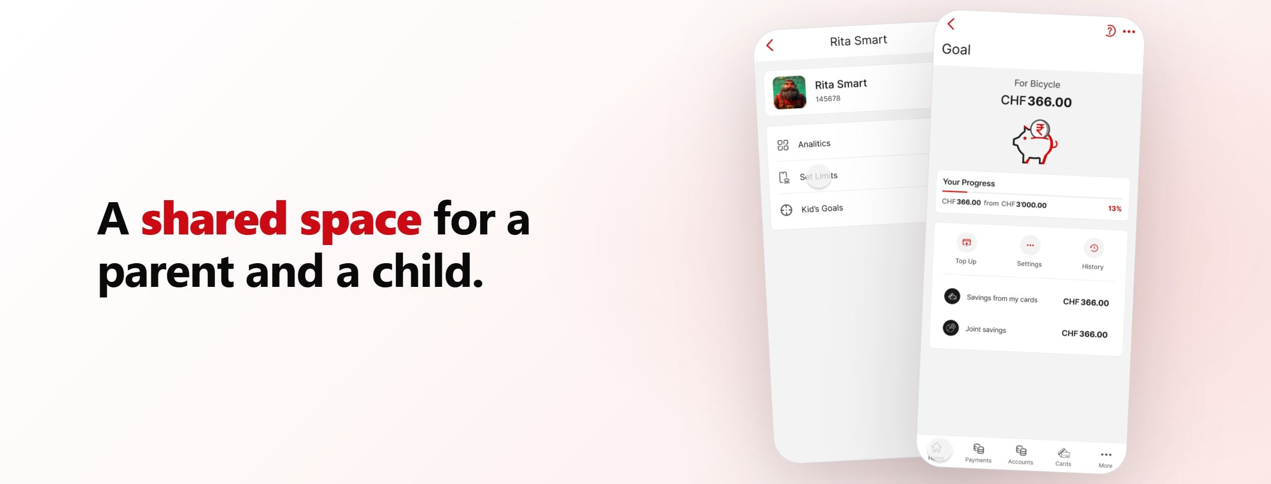
A project briefed by UBS to simplify its mobile app around financial education. The team's response was a shared family space for parents and children. My part was the collaborative user research and the detailed user flows that mapped how it would actually work.
- Role
- Research & user flows
- Year
- 2025
- Host
- SUPSI × UBS
- Scope
- Team of five
- Shipped
- Research, user flows, Figma prototype
The brief from UBS was specific and not about families at all: simplify the UBS mobile app, with a focus on financial education, for everyday retail clients aged roughly thirty to sixty. Younger users and children were named only as a "nice to have".
The reasoning behind it was concrete. A confusing information architecture makes products hard to find and pushes people away. Banking language creates confusion, insecurity, and stress, which lowers engagement and sign-ups. And past testing had shown that education inside the app was seen as a genuine benefit, something worth investing in for loyalty and retention.
So the real problem was not "design a family app". It was: how do you make a dense banking app easier to understand, and turn financial education from a buried feature into a reason people stay?
- The define phase: the affinity diagram, the personas, the How Might We questions, and the problem and goal statements
- The functionalities and the full user flows, including the parent journey and the teen journey
- User research with the team: the everyday-banking survey, desk research, and analysis of the app's own store reviews
- The final visual design and UI polish, led by others in the team
Team of five (Andrii Ioffe, Edoardo Carlani, Giorgia Salmoiraghi, Jérémy Martin, Oleksandra Drapushko) for ID111 Designing Digital Experiences at SUPSI, with a research phase run collaboratively. Briefed by UBS.
Listening before designing
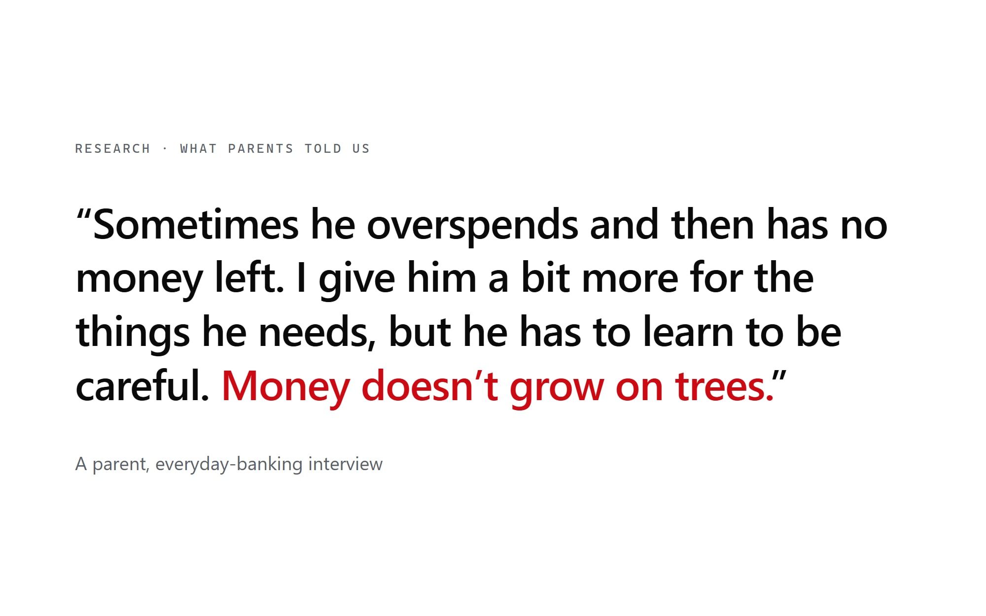
The research was a genuinely collaborative effort, and the part I most enjoyed. As a team we combined desk research on financial education, financial literacy, everyday banking, and the competitive landscape; a survey on everyday banking and money habits; and a round of user interviews, each of us running our own. We also turned the app on itself, analysing UBS's own store reviews to hear frustrations in users' own words.
We synthesised it through experience maps (a parent's journey, spending, budgeting, even being scammed) and an opportunities-and-insights brainstorm. The picture was consistent: people struggle with banking language and a crowded interface, and they value being helped to understand money rather than just being shown more products. Pulling those threads into a single clustered picture was the bridge into the define work I then led.
Making the 'nice to have' the point
The brief put financial education at the center and listed younger users and children only as a nice to have. The team's bet was to make that nice to have the heart of the concept: if education is the goal, the most natural place to start is where money habits are first formed, between parents and children.
We benchmarked the family-finance space (the goHenry and Greenlight kind of product, family wallets, design guidance for teenagers) and reframed the work around a shared family space inside the UBS app, where a parent and a child manage money, limits, and learning together.
From research to a problem worth solving
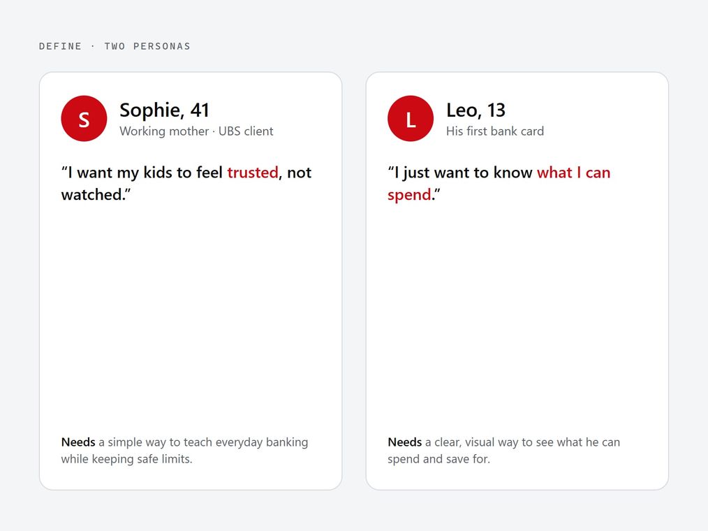
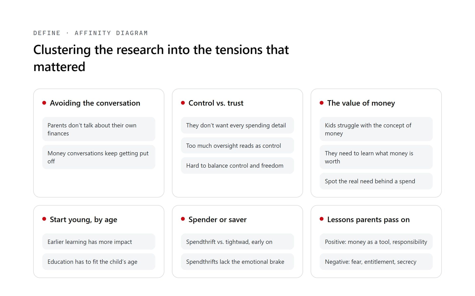
With the direction set, I ran the define phase myself. I clustered the research into an affinity diagram, then built two personas to keep the work honest: Sophie, a forty-one-year-old working mother and UBS client who wants to raise responsible kids without making money taboo or losing her sense of control, and Leo, thirteen, with his first bank card, who mostly wants to know what he can spend and to save for something bigger.
The tension between them produced a set of How Might We questions (turning everyday banking into learning moments, making the value of money visible, supporting age-appropriate education) and two sharp problem statements. Sophie needs a simple way to teach everyday banking while keeping safe limits, because she does not feel equipped to guide them; Leo needs a clear, visual way to see what he can spend and save, because he sees money only as something for fun.
From gaps to a big idea
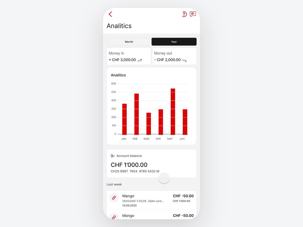
Before designing any flows, I benchmarked the field, including UBS's own offering for younger users, and named the gaps. Financial education sat off to the side in articles, there was no learning journey, no real child interface or analytics, rewards were not tied to good habits, and almost nothing supported ongoing parent-and-child money conversations.
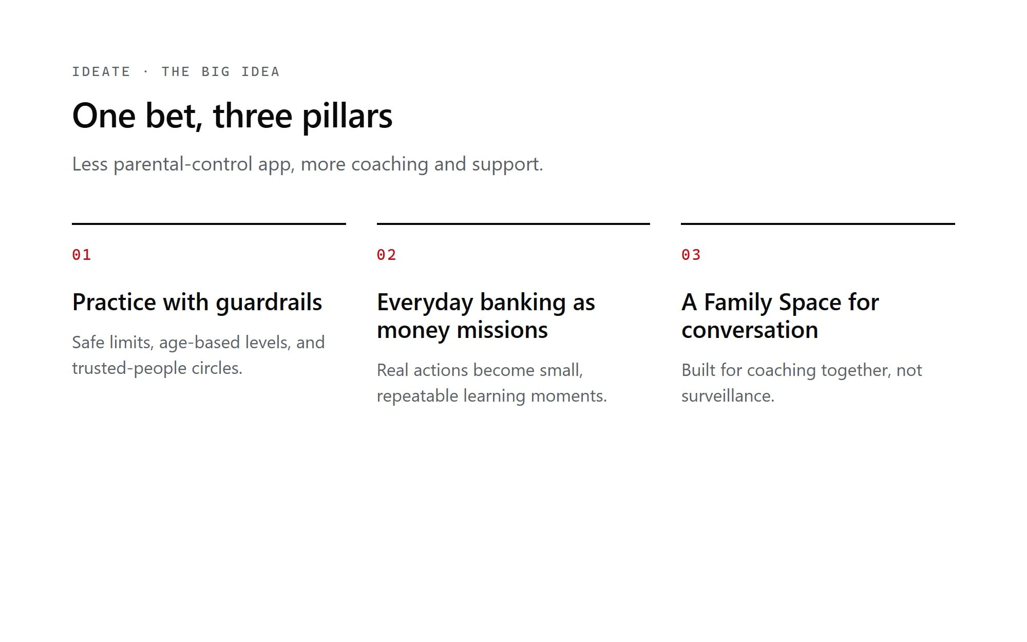
I ran Lotus-method ideation on the How Might We questions, clustered the results, and converged on a big idea with three pillars: practice with guardrails (safe limits, age-based levels, trusted-people circles), everyday banking as "money missions" where real actions become small learning moments, and a Family Space built for conversation rather than surveillance. That last pillar came straight from the research: parents told us they did not actually want the fine detail of their child's spending, because too much oversight reads as control and erodes trust. The line that kept us honest was "less parental-control app, more coaching and support."
Four flows, end to end
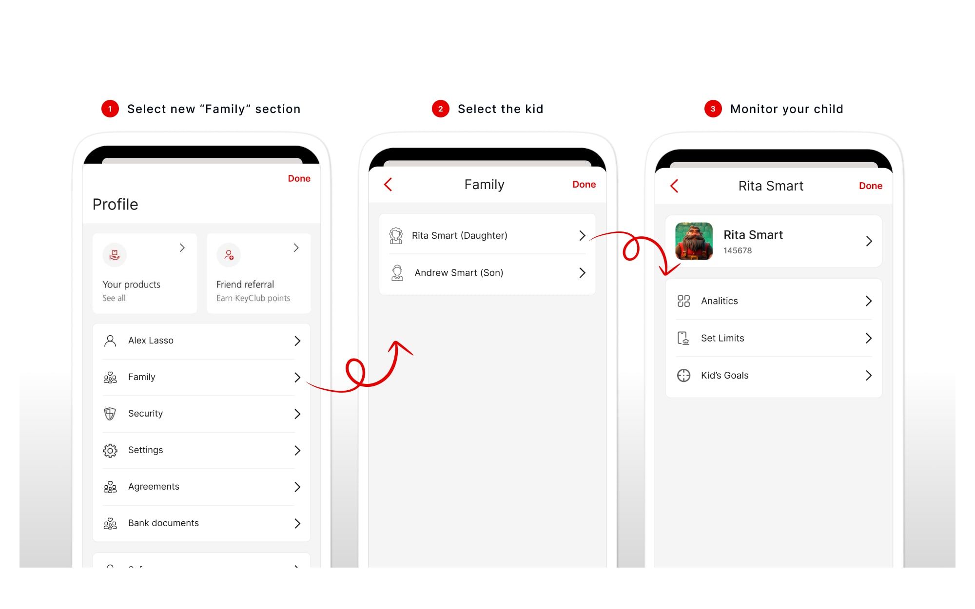
From the big idea I mapped four end-to-end user flows: activating the Family Space, the parent's space, the child's space, and a monthly digest built for a parent-and-child money conversation. The activation flow alone handles the messy real cases (no family profile yet, linking an existing account, opening a youth account, a child under twelve) with system steps and pre-filled recommended limits, so a parent is never configuring from a blank slate.
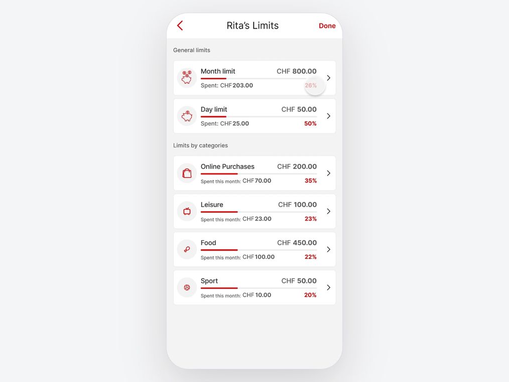
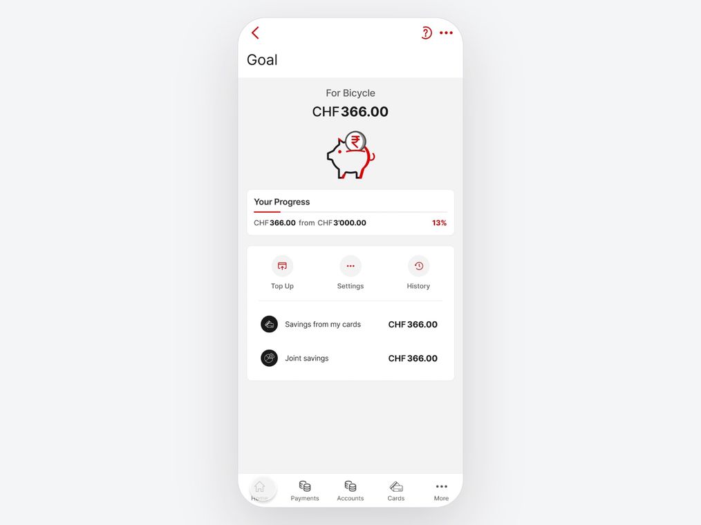
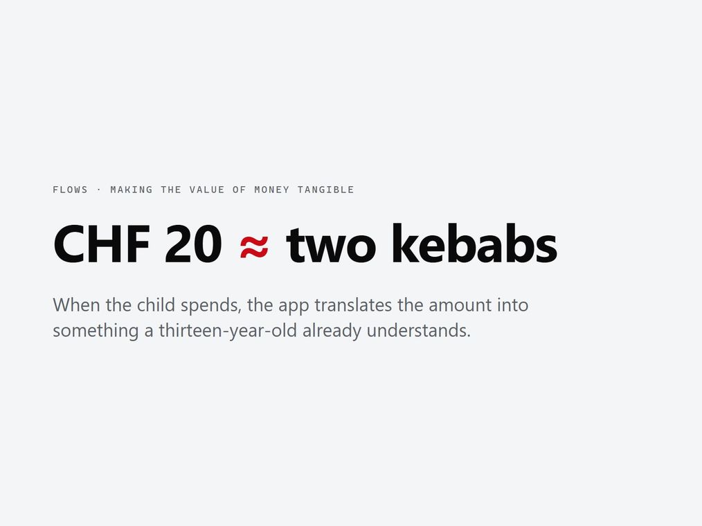
The flows carry the mechanics that make the idea concrete. A parent sets total, daily, weekly, and category limits once and then largely leaves it alone; chores convert into pocket money the child earns; saving "achievements" turn a goal like a bicycle into visible progress. My favorite is a small one: when a child spends, the app translates the amount into something they understand, "twenty francs is about two kebabs", making the value of money tangible rather than abstract. The teen gets their own flow because their relationship to money, autonomy, and privacy is genuinely different, and the flows are the part of this project I owned end to end.
A research foundation built from a survey, desk research, and the app's own user reviews, pointing clearly at simplification and education as the real opportunities.
Four end-to-end user flows (activation, the parent space, the child space, and a monthly digest), turning the big idea into something navigable screen by screen.
A Figma prototype of the shared Family Space, presented directly to the UBS team, which turned a term project into a real client conversation.
What I take from this project is the part of the work that is easy to skip and hard to fake: the research and the user flows. The flows especially are where a nice concept either becomes coherent or quietly falls apart, and mapping both the parent and the teen journeys end to end is the work I am proudest of, even where the final prototype took a different shape. Designing inside a real client constraint, for an app as dense as UBS's, made that rigour matter more, not less.